(This article originally appeared as a Facebook post on 26 April 2020 and was updated on 11 May 2020.)
“There are three kinds of lies:
lies, damned lies, and statistics.”
(often attributed to Mark Twain)
This is the tale of two charts, both showing COVID-19 Mortality Rates per Capita (MRpC) or the number of deaths per 100,000 population due to COVID-19. The MRpC allows us to compare the mortality rate of different countries, regions or cities, in proportion to their population.
Statistical charts, when well designed, can give us important information concisely in just a glance or a few microseconds. When badly designed, however, we could be staring at a chart for minutes without having a clue about what it’s trying to tell us. Sadly, statistical charts are sometimes used to deceive us.
One of the two charts we’ll look at was used by President Trump on 18 April 2020, the other by RIVM, the Dutch government’s institute for public health and environment, on 22 April 2020. We will look at the latter first. Before we continue, when I would ask you now to guess which of the two is telling the truth, you might have guessed wrong, but the title of this post is a giveaway.
I have watched on tv several technical briefings on the Coronavirus update by RIVM to members of the Dutch parliament and every time I couldn’t help getting the feeling that they’re putting a positive spin on almost everything presented. There was this uneasy feeling that behind the seemingly impressive analyses there are things they were not telling us.
The Netherlands had the 6th COVID-19 Mortality Rate per Capita (MRpC) in the world in the past week(s) but the RIVM just glossed over this fact in their presentation on 22 April 2020, as if they’re hoping that no one would notice. People are dying like flies and yet their attitude is “everything is fine and under control”.
On page 8 of the RIVM presentation on 22 April was a chart in the top right corner, titled “Deaths per 100,000 population” with a red border around the title giving the impression that is what you’re looking at. Well, not quite, as I will explain. Let’s look at the chart in more detail.
Let’s look at page 8 of the RIVM presentation that contains the graph in the top right corner. Page 8 is titled “COVID-19 | NL 21 april 2020 – overleden” (“COVID-19 | NL 21 April 2020 – deaths”).
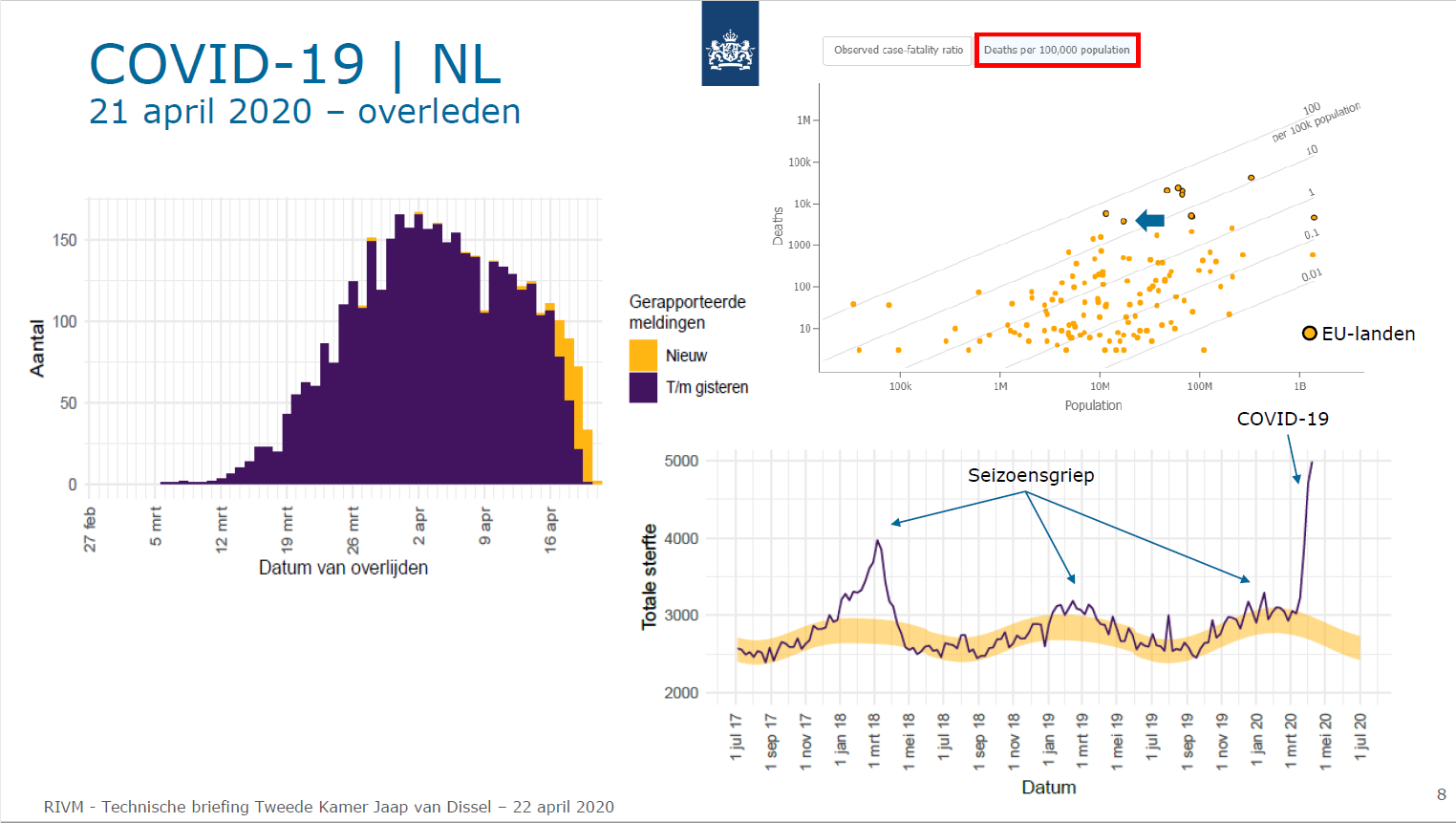
Let’s zoom in on the top right corner of page 8 of the RIVM presentation, to see the graph that we are going to discuss.
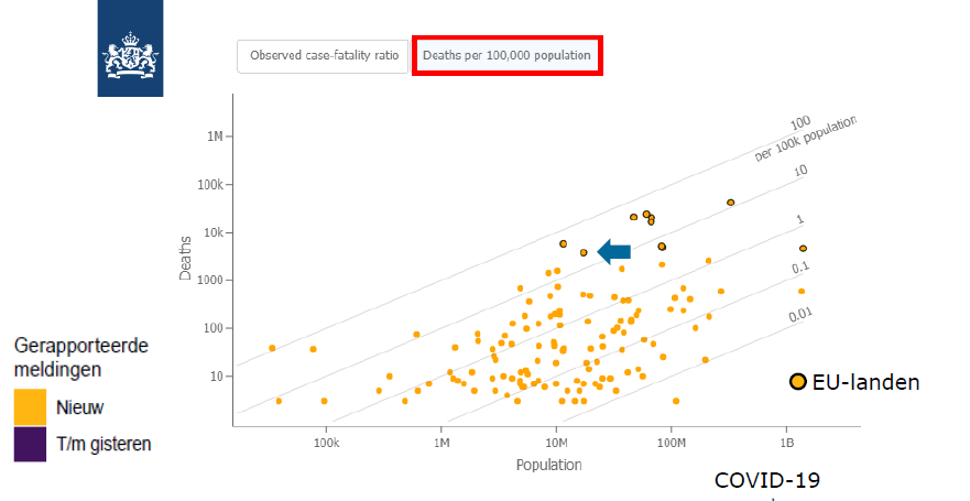
RIVM COVID-19 Technical Briefing to Dutch Members of Parliament on 22 April 2020.
There are texts from the other two graphs extending to the space of this graph, in the bottom left corner (“Gerapporteerde meldingen Nieuw T/m gisteren”) and in the bottom right corner (“COVID-19”). These texts have nothing to do with the “Deaths per 100,000 population” graph shown here.
The title on the horizontal axis is “Population” and on the vertical axis “Deaths” which rang a bell in my mind. They are using a logarithmic scale on both axes, which is fine. This allows us to see very large and very small numbers on the same chart. However, there is no “number of deaths per 100,000 population” on either axis to measure numbers against. To be fair, there are curved diagonal lines titled “per 100k population” but they are not easy to interpret and they can be misleading as we will see later.
The body of the chart shows 100 or more yellow dots, each dot supposedly representing a country and there is a big blue arrow pointing to a dot that I assumed represents the Netherlands. Nine (9) of the yellow dots have a dark blue circle around them and the legend in the right bottom corner explains that the dots with a dark circle are “EU-landen” or “EU countries”.
There are 27 EU member states. If only nine are marked, where are the other 18? The only credible reason for those countries being off the chart is if no deaths have been reported in the missing countries. We all know that ALL EU member states have COVID-19 deaths.
But it gets worse. Three of the nine “EU countries” are actually non-EU countries, as I found out later. The five EU countries were marked without identifying each country and one was identified as the Netherlands by the arrowhead. The other 21 EU countries could not be recognised from the 100+ dots.
Knowing the position of the Netherlands on the chart it was easy to work out (by checking the population on the x-axis) that Belgium was the dot nearby to the left and I also recognised the cluster of 4 “EU country” dots higher to the right as Spain, Italy, France and the UK because they often travel together on charts like these. But wait, hasn’t the UK left the EU already? The EU dot with the bulge on the right at about the same level as the NL with a population of almost 100 million is probably Germany.
I couldn’t work out which EU countries the two dots further to the right were representing. One of the two is a bit higher, meaning having more deaths. One has a population between 100 million and 1 billion and the other has more than 1 billion. I know that the EU is working on “enlargement” all the time but I didn’t know they were THAT successful.
Here’s the transcript of the RIVM presentation explaining the graph, in Dutch, with an English translation below:
"De grafiek daarboven toont dan nog even de relatieve plaats van Nederland met betrekking tot het aantal gevallen van COVID-19 overlijdens, en Nederland is aangegeven met het pijltje ten opzichte van andere Europese landen, dat zijn de gele bolletjes met de donkere cirkeltjes eromheen, afgezet ten opzichte van de totale bevolking dus per honderd duizend bevolking ... en wat u eigenlijk ziet is dat uhm… Nederland een gemiddelde plaats inneemt uhm ... eerder aan de... wat aan de lagere kant dan aan de hogere kant...
maar u moet zich wel realiseren dat dit natuurlijk opnieuw mede bepaald wordt door het testbeleid, ja, als het testbeleid wordt uitgebreid en men meer uhm... ernstige patienten ook gaat testen dan zal natuurlijk de relatieve sterfte gaan afnemen omdat de uhm... noemer groter wordt."
Google-translated to English:
"The graph above shows the relative position of the Netherlands with regard to the number of cases of COVID-19 deaths, and the Netherlands is indicated with the arrow relative to other European countries, which are the yellow circles with the dark circles around them, compared to the total population per hundred thousand population ... and what you actually see is that uhm... the Netherlands occupies an average position uhm... rather on the ... somewhat on the lower side than on the higher side ...
but you should realize that this is of course partly determined by the test policy, yes, if the test policy is expanded and more uhm... serious patients are also going to be tested, the relative mortality will of course decrease because the uhm... denominator gets bigger."
To help in analysing the RIVM graph, I have created several charts with similar attributes as RIVM’s graph, with data sourced from worldometers.info (https://www.worldometers.info/coronavirus/). Initially, I used data from 21 April 2020, the day before the RIVM presentation, but detailed inspection of the data shown on the graph revealed that the RIVM graph was based on data from 20 April 2020, two days before the presentation.
I will call RIVM’s chart a “graph” from here on and call my charts “charts” (the words have the same meaning) to distinguish between RIVM’s graph and my charts.
Let’s look at my Chart 1a
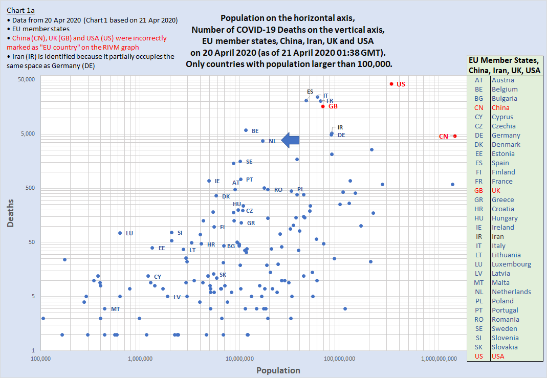
Countries identified are the 27 EU member states, China, Iran, the UK and the USA.
The dots representing EU member states, the UK, USA and China are showing their international 2-letter code for easy identification. Also Iran’s dot, to show that Iran and Germany are obscuring each other. The two countries have almost the same population (~84M) and the numbers of deaths are not far apart: on 20 April Iran had a cumulative total of 5,209 deaths and Germany 4,862. That explains the dot with the bulge because what looks like one fat dot, are two overlapping dots.
Let’s parse the RIVM presentation (about the graph) phrase by phrase.
"The graph above shows the relative position of the Netherlands with regard to the number of cases of COVID-19 deaths,”
Because the graph uses “Deaths” on the vertical axis, it does NOT show the “relative” position but the ABSOLUTE position of the Netherlands and other countries on the graph, in relation to COVID-19 deaths. The very idea of having a Mortality Rate per Capita or in other words “number of deaths per 100,000 population” is to allow us to compare countries in PROPORTION to their population size.
I will explain more as we go along but for now just note that:
- A graph with the population on one axis and deaths on the other is nothing more than a “Deaths and Population” graph as it simply shows countries on the crossing point of each country’s (absolute) population size and (absolute) number of deaths. That is the graph shown by RIVM. There is nothing “relative” about it. And the title is highly misleading, if not wrong.
- A graph showing a Mortality Rate per Capita (MRpC) or “relative mortality” must show the MRpC, calculated as: number of deaths divided by 1/100,000th of the population size, on one of the axes. It can be (and usually is) shown independently on a graph, without showing the number of deaths or population size, because the MRpC is derived from the other two numbers. Trump’s chart is an example of showing only the “Deaths per 100,000 population” numbers. We’ll see that later.
Continuing with the presentation:
“… and the Netherlands is indicated with the arrow relative to other European countries, which are the yellow circles with the dark circles around them, compared to the total population per hundred thousand population"
On RIVM’s graph only the NL was identified, by an arrowhead. The other dots were anonymous.
On Chart 1a we can see the 2-letter code of all 9 countries that were marked as “EU countries” on RIVM’s graph. It also shows the 2-letter code and the position of the 21 other EU countries that were not marked on RIVM’s graph. To my surprise, three of the nine countries that were claimed by RIVM as EU countries were actually non-EU countries: the UK, the USA and China! The 2-letter codes of these 3 countries are in red letters on Chart 1a so you can easily find them. Better not tell Boris, Trump and Xi. What is the error percentage of this? I would say it’s: 21 (not marked) + 3 (wrongly marked) out of 27 member states = 88.88% errors.
The last part of that phrase ending with "compared to the total population per hundred thousand population" doesn’t make sense. The graph doesn’t show any “per 100K” number; not at the axis scales and not at the data points.
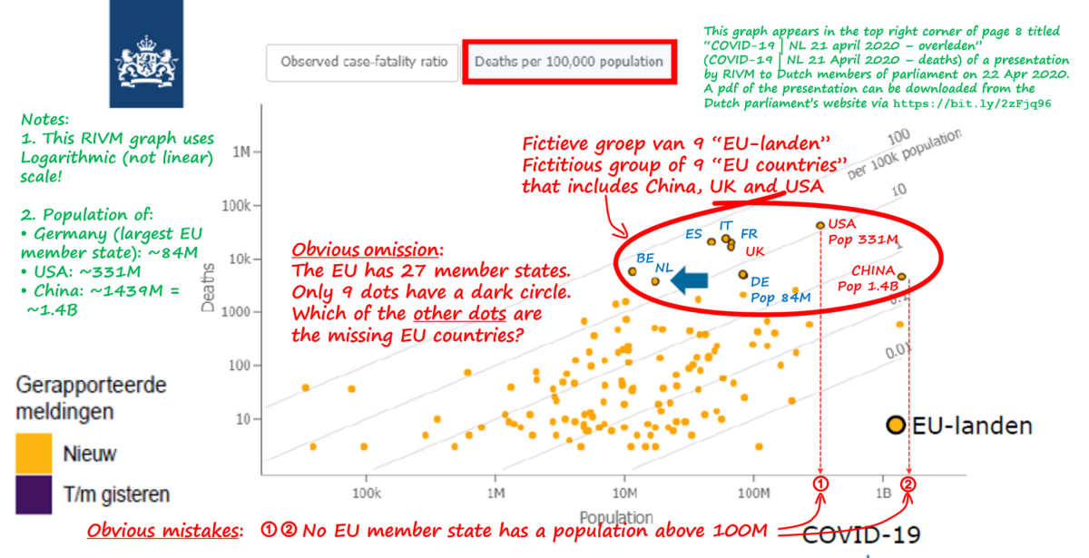
The next image shows the mistakes and omissions that we have found in RIVM’s graph

The annotations highlight mistakes and omissions on the RIVM graph.
Continuing with the presentation:
"... and what you actually see is that uhm... the Netherlands occupies an average position uhm... rather on the ... somewhat on the lower side than on the higher side ..."
By saying “on the lower side” I assume he’s suggesting that the Netherlands has a lower number of deaths compared to other EU countries.
Let’s look at Chart 2a
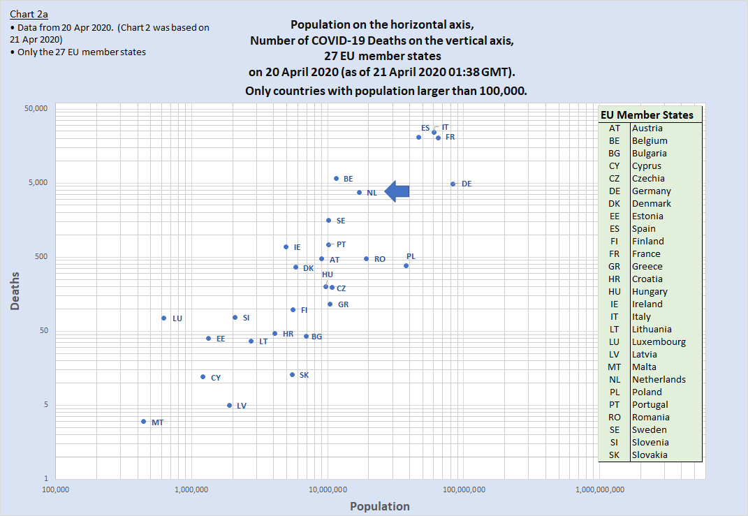
Countries identified are the 27 EU member states.
Dots representing non-EU countries have been removed to clearly show the Netherlands’ position
between the other EU member states, in terms of number of COVID-19 deaths and population.
Chart 2a is similar to Chart1a but it only shows the 27 EU member states without the dots of the other (non-EU) countries. The UK, USA and China do not appear on this chart. This allows us to clearly see where the Netherlands is positioned among the other 26 EU member states.
Five EU countries (BE, DE, ES, FR & IT) are located HIGHER on the chart than the NL (meaning they have more deaths than the NL) and 21 (AT, BG, CY, CZ, DK, EE, FI, GR, HR, HU, IE, LT, LU, LV, MT, PL, PT, RO, SE, SI & SK) are located LOWER on the chart than the NL (meaning they have fewer deaths than the NL) so the Netherlands is in a much WORSE position than the RIVM wanted us to believe. It has fewer deaths than 5 EU countries but more deaths than 21 EU countries, some with larger populations than the NL. Countries with larger populations than the NL but with fewer deaths appear more to the right side of the NL and lower on this chart, and we can find Romania (RO) and Poland (PL) there.
Looking at this chart, that shows the actual number of COVID-19 deaths on the Y axis, would you say the Netherlands “occupies an average position”? Just visually, I would say that the average position is approximately where Denmark, Hungary, Czechia and Greece are.
When ranking the 27 EU countries by the number of COVID-19 deaths, from high to low, Hungary is in the median position (14th place) on 20 April 2020.
Looking at averages, the total number of reported COVID-19 deaths in the 27 EU member countries up to and including 20 April 2020 was 85,325. That is an average of 3,160 COVID-19 deaths per EU member state.
The Netherlands had a total of 3,751 COVID-19 deaths on 21 April 2020. That is 18.7% ABOVE the EU average. Other countries with higher than average COVID-19 deaths are Belgium, France, Germany, Italy and Spain. The 21 other EU member states have lower than average COVID-19 deaths.
Let’s look at Chart 2b
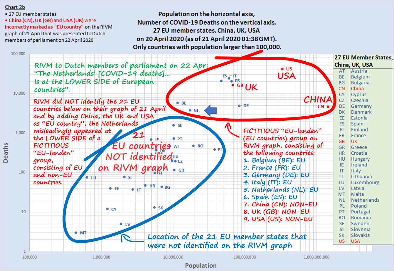
The countries shown and identified are the 27 EU member states, plus China, the UK and
the USA, the three countries incorrectly identified as “EU country” on the RIVM graph.
Chart 2b shows where all 27 EU members are, plus the three countries China, the UK and the USA that were mistakenly identified as EU countries. There are comments placed on this graph that explain the mistakes and omissions of the RIVM graph in more detail.
Hiding 21 EU member states that have fewer deaths and making it look as if the UK and USA, that appear higher on the graph with more deaths, are also EU member states, and then proclaiming how low the Netherlands is on the chart of deaths in comparison to other EU countries, is a blatant attempt to mislead members of parliament and the public, to let them believe that the Netherlands has fewer deaths than most other EU countries. Unbelievable that someone or some people at RIVM think they can get away with that. That looks like fraud to me.
To make matters worse, the graph made some other EU countries, like Germany, look much worse than they really are.
The Netherlands had a total number of 3,751 COVID-19 deaths on 20 April and with a population of 17.1 million people, it had 21.89 deaths per 100,000 population. This placed the Netherlands in the 6th place on a global ranking by MRpC.
Germany had a total number of 4,862 COVID-19 deaths on 20 April (higher than the Netherlands) but because of the much larger population of around 84 million people Germany had (a lower) 5.80 deaths per 100,000 population, which placed Germany as 16th on the global ranking by MRpC.
Because RIVM misleadingly placed “Deaths” instead of “Deaths per 100K population” on the vertical axis of the graph, Germany appeared higher on the chart than the Netherlands.
Unsuspecting viewers who see a graph titled “Deaths per 100,000 population” showing Germany placed higher on the graph than the Netherlands will assume that Germany has more deaths per 100,000 population than the Netherlands. Merkel will not be amused.
I have attached a complete list of COVID-19 MRpC figures based on 20 Apr 2020 data for 153 countries, they are the last five images attached to this post (at the bottom of this page).
And finally, the last part of the presentation of the graph:"... but you should realize that this is of course partly determined by the test policy, yes, if the test policy is expanded and more uhm... serious patients are also going to be tested, the relative mortality will of course decrease because the uhm... denominator gets bigger."
The last part: “the relative mortality will of course decrease because the denominator gets bigger” doesn’t make sense.
The formula for “relative mortality” or Mortality Rate per Capita (MRpC) is
Number of deaths / (1/100,000th of Population); or could be written as
Number of deaths / (Population / 100,000); or could be written as
Number of deaths * 100,000 / Population
There is always “Population” in the denominator.
The population doesn’t get bigger as a result of more testing (unless testing will somehow cause people to procreate in large numbers, but the result of that will only show in the population numbers nine months later, while we’re looking at a shorter time frame here).
Instead of saying “because the denominator gets bigger” it would have made more sense if the presenter said “because the numerator becomes smaller”; (the numerator being “number of deaths”; in Dutch, the numerator is “de teller”) because we can imagine that more testing will or may, directly and indirectly, prevent more people from dying,
Maybe the presenter had the “Case Fatality Rate (CFR)” in mind, where the formula is: Number of deaths divided by Number of diagnosed cases, with “number of diagnosed cases” as the denominator. I’m thinking that, because the RIVM graph is showing a second title “Observed case-fatality ratio” (not bordered in red) to the left of the other title.
RIVM has probably been observing both CFR and MRpC numbers and graphs, which may get confusing. The CFR and MRpC are both about deaths but they are very different and are often confused with one another. But of course, I’m just speculating here about what the presenter was thinking, trying (in his defence) to make sense of his presentation.
Let’s look at Chart 3a
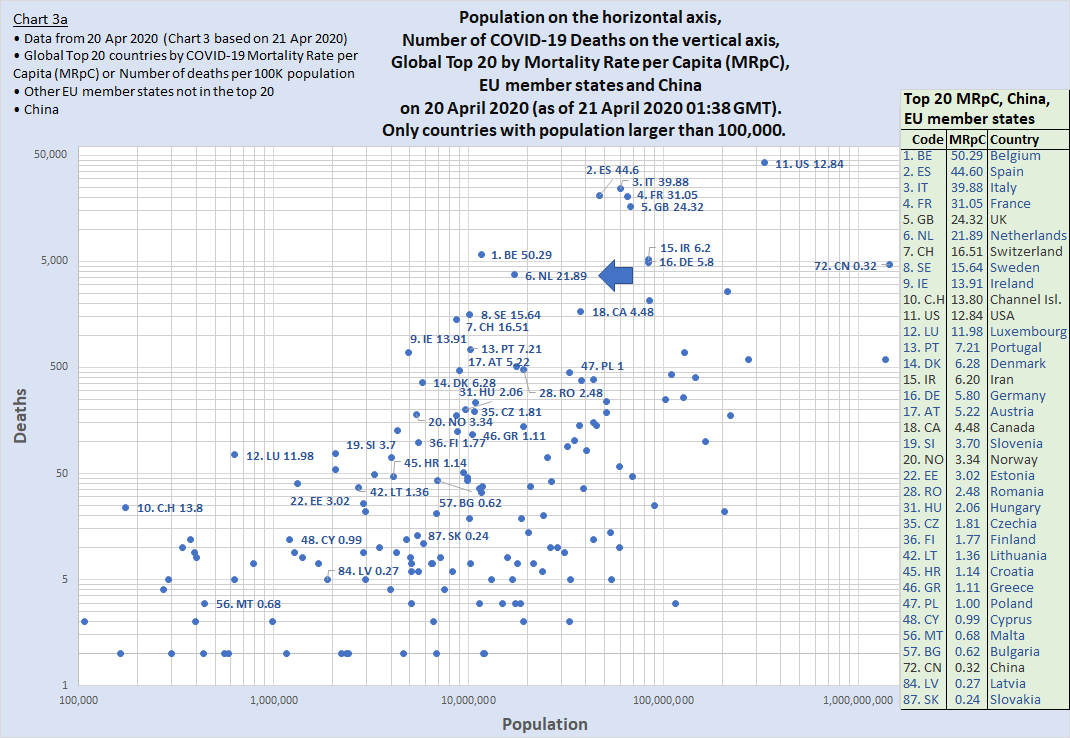
The countries identified are the Top 20 countries by MRpC, EU member states and China at position 72.
I have added the actual number of “Deaths per 100,000 population” to each data point, as well as the global ranking, to see if the extra information will make everything more clear, despite the misleading “Deaths” on the vertical axis.
So “1. BE 50.29” means: in the first place (with the highest MRpC) is Belgium with 50.29 deaths per 100K.
But even with all the extra information, it is still not easy to read the chart or to find the countries by ranking. Number 1 to 9 are still relatively easy to find (they are in the upper centre part of the chart) but number 10 Channel Islands is near the bottom left corner and number 11 USA is in the top right corner. This Chart 3, and the RIVM graph that it is based on, are absolutely NOT suitable to show relative deaths or MRpC. Putting “Deaths” on an axis of a “Deaths per X population” graph is a big NO-NO.
Now let’s look at Chart 4a
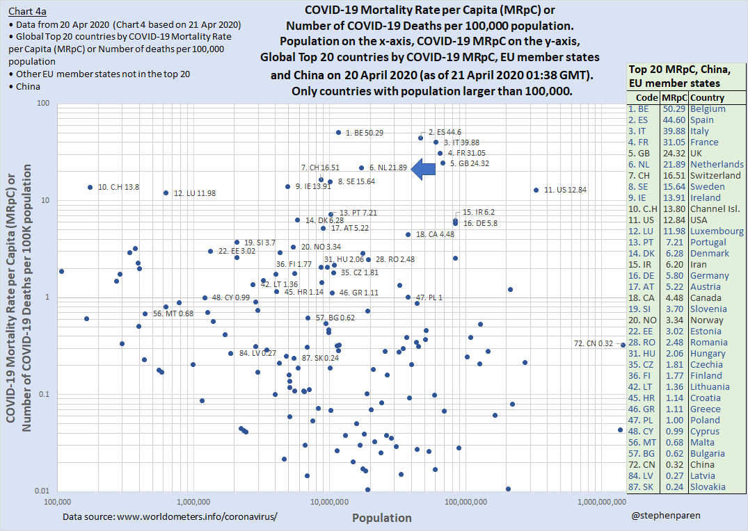
(Number of COVID-19 deaths per 100,000 population) on the y-axis.
On Chart 4a I have simply placed the number of “Deaths per 100,000 population” on the vertical axis and voila, the resulting MRpC chart clearly shows the top 20 countries (including the UK and USA) as well as all EU countries and China in the correct order from top to bottom, by descending MRpC. The USA, Germany and China appear (correctly) much lower on the chart. Trump, Merkel and Xi will be pleased. Phew, I have just helped avoid a possible attack on the NL by the superpowers. You’re welcome!
To see Chart 4a WITHOUT the many anonymous dots that clutter the chart, see Chart 4b
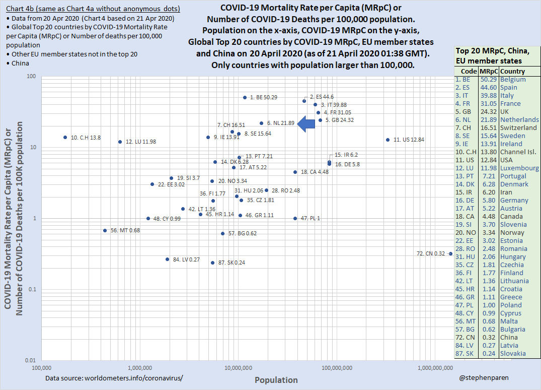
On Chart 4b you can see more clearly the position of the Netherlands in relation to the other 26 EU member states AND the top 20 countries in the world with the highest COVID-19 MRpC.
Let’s have a look at Chart 5a, a bar chart that shows the Netherlands in the sixth place of a Global List of countries world-wide by Number of COVID-19 deaths per 100,000 population
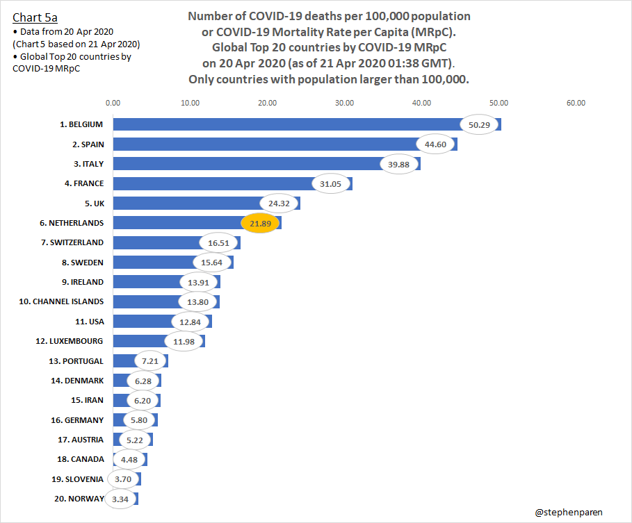
Number of COVID-19 deaths per 100,000 population on horizontal bars,
on 20 Apr 2020 (as of 21 Apr 2020 01:38 GMT).
I have also created Chart 5b that shows the Netherlands among all 27 EU member states on a bar chart of Number of COVID-19 deaths per 100,000 population
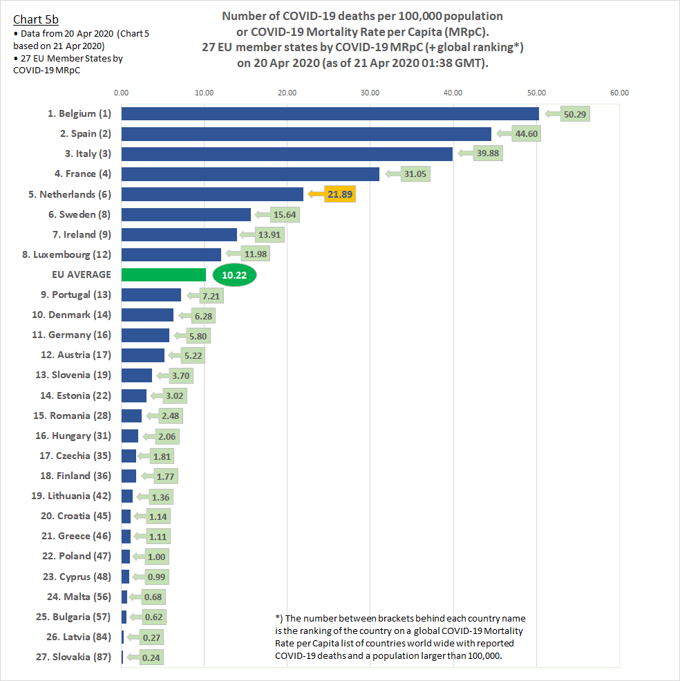
Number of COVID-19 deaths per 100,000 population on horizontal bars,
on 20 Apr 2020 (as of 21 Apr 2020 01:38 GMT).
The RIVM could have just used a simple bar chart, like the examples shown on Chart 5a and Chart 5b, if all they wanted was to clearly show the Dutch position worldwide (Chart 5a), or in comparison with other EU countries (Chart 5b).
These charts are similar to the chart used by Trump on 18 April 2020, see the media report.
Let’s have a look at Trump’s chart
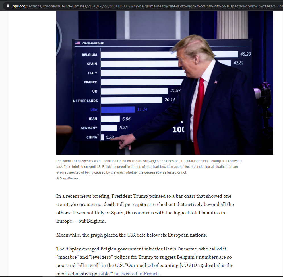
by COVID-19 Mortality Rate per Capita (MRpC) or Number of COVID-19 deaths
per 100K population, on 18 April 2020.
The figures on Trump’s chart are correct and Trump was right. Even if some countries were left out in the ranking, which is permissible due to space constraints. For example, between the Netherlands and the USA, Switzerland and Sweden were left out among others, but as no ranking numbers were shown he didn’t claim that the USA was 7th. Alternatively, his chart could have shown “6. Netherlands, 11. USA, 14. Iran, 16. Germany and 69. China” to show each country’s relative position on a complete list.
It would have been perfect if his chart showed a note or disclaimer that certain countries, e.g. those with a population lower than 100K, were not included in the chart. Because the list looks different when tiny countries are included.
On 18 April, using data from 17 April and including all countries regardless of size, the top list of countries and territories by descending MRpC is as follows: San Marino, Andorra, Belgium, Spain, Italy, France, UK, Sint Maarten, Netherlands, Switzerland, Sweden, Channel Islands, Luxembourg, USA, etc.
So not Belgium but San Marino, with a population of ~40K and 40 deaths had the highest MRpC (117.89) in the world on 17 April 2020.
While I’m typing this, the media is all about Trump’s advice to inject disinfectants. He denies and claims the injection idea was sarcasm.
Anyway, credit should be given where credit is due, so:
- 1 point goes to Trump for being transparent and showing a clear and correct chart; and
- zero points go to RIVM for obfuscating facts and showing a graph that seems to have been designed to mislead.
If you have a question or need any part of this explained in more detail, please post a comment below.
The RIVM presentation can be downloaded in pdf format from the Dutch parliament’s website.
You can watch a video recording of the entire RIVM Technical Briefing and questions asked by members of parliament on the website of the Dutch Parliament. or on the NPO website but maybe only if you live in the NL. Try using a VPN from abroad. The part that discusses the graph that we have analysed here starts at approximately 8 minutes from the start and has a duration of 50 seconds.
The RIVM website is at rivm.nl.
Data source for creating charts: www.worldometers.info/coronavirus/
Addenda
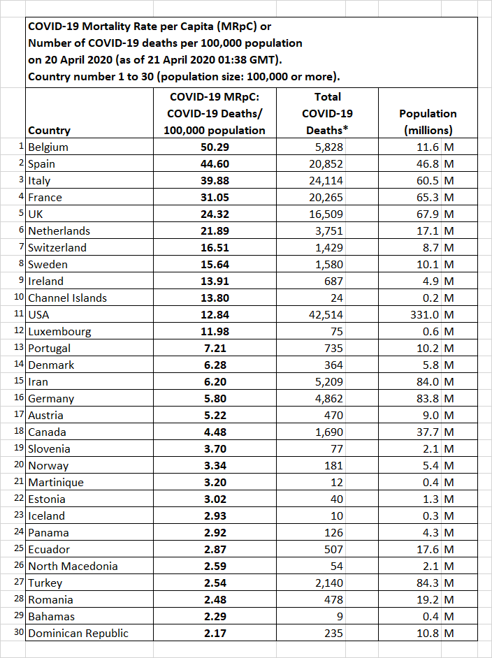
based on 20 April 2020 data for 153 countries and territories worldwide
with at least 1 or more reported COVID-19 deaths and a population size
of at least 100,000 people. Part 1 – Country 1 to 30.
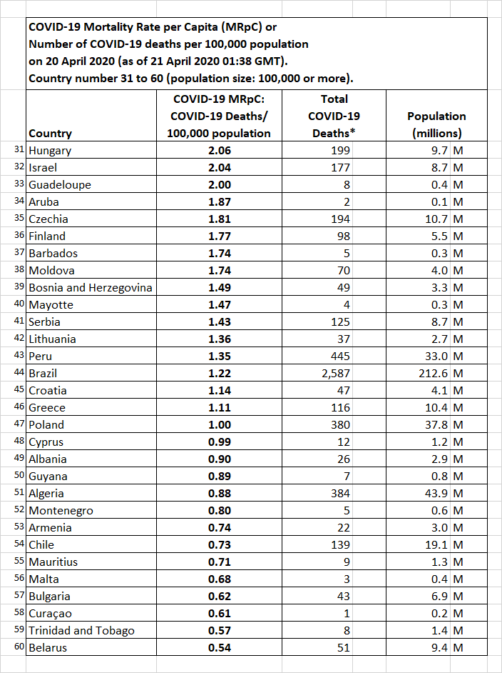
based on 20 April 2020 data for 153 countries and territories worldwide
with at least 1 or more reported COVID-19 deaths and a population size
of at least 100,000 people. Part 2 – Country 31 to 60.
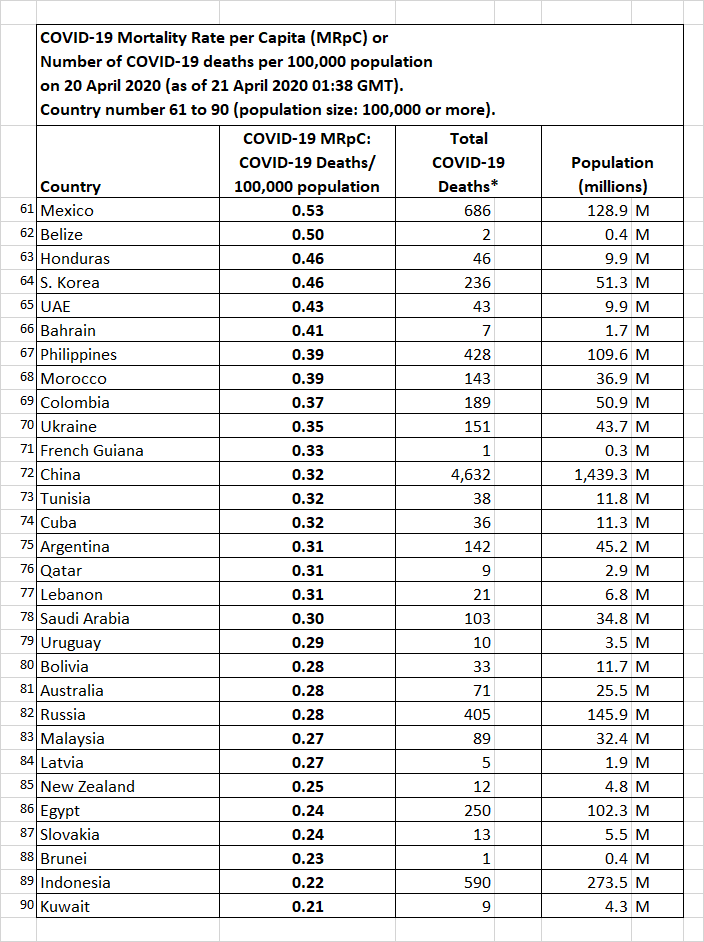
based on 20 April 2020 data for 153 countries and territories worldwide
with at least 1 or more reported COVID-19 deaths and a population size
of at least 100,000 people. Part 3 – Country 61 to 90.
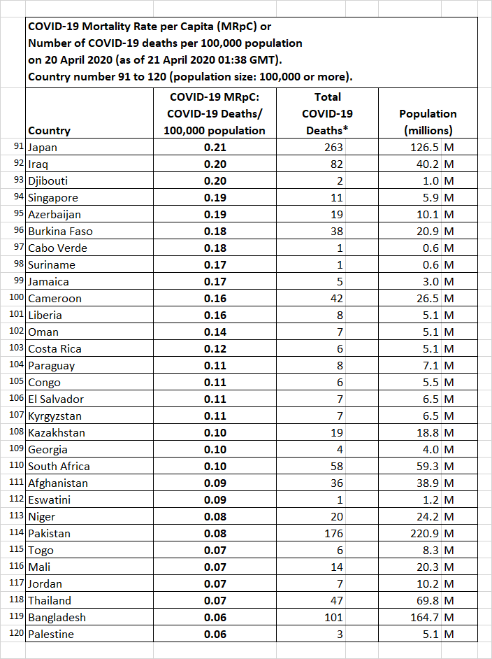
based on 20 April 2020 data for 153 countries and territories worldwide
with at least 1 or more reported COVID-19 deaths and a population size
of at least 100,000 people. Part 4 – Country 91 to 120.
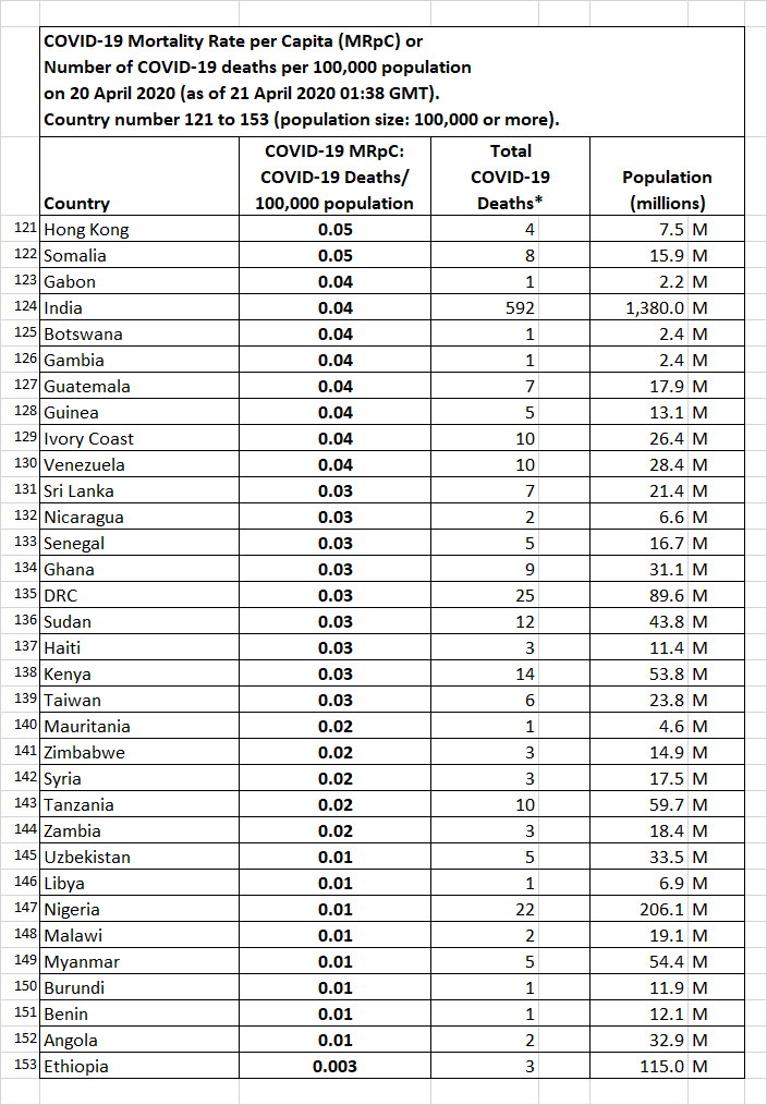
based on 20 April 2020 data for 153 countries and territories worldwide
with at least 1 or more reported COVID-19 deaths and a population size
of at least 100,000 people. Part 5 – Country 121 to 153.
