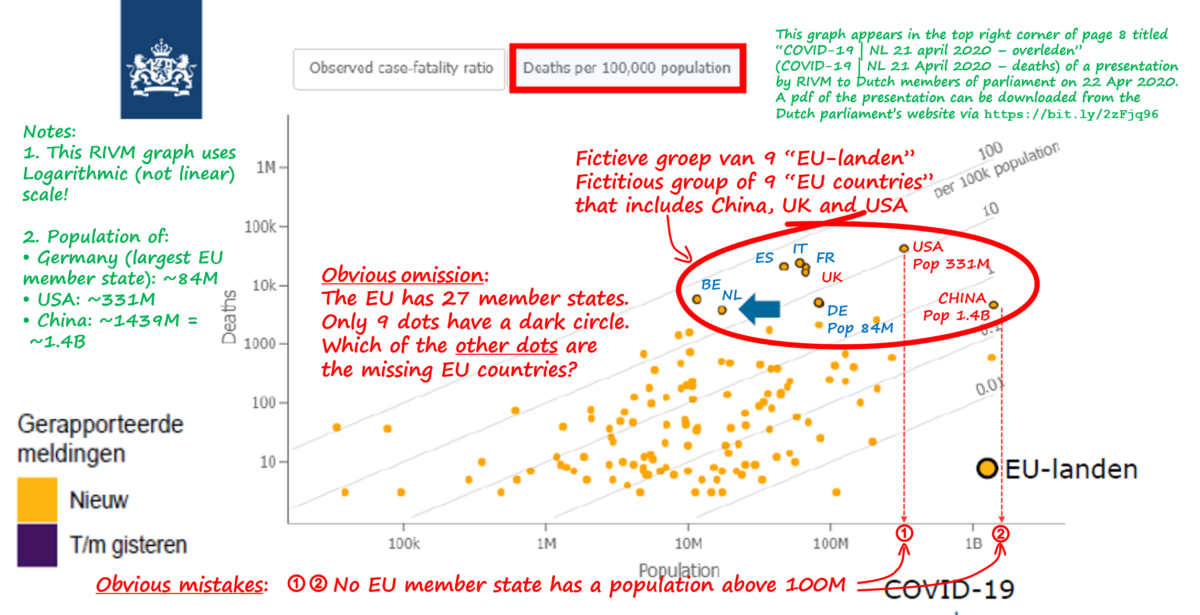
Summary: Within a period of 4 days in April 2020, President Trump in the USA and the Dutch RIVM (Institute for Public Health and Environment) in the Netherlands, presented what should have been a simple chart, showing countries with the highest number of COVID-19 Deaths per 100,000 population. Trump’s chart was an easy to read bar chart – in a glance one can see that Belgium has the highest number, followed by Spain, Italy, France, UK, Netherlands, USA, Iran, Germany and China. In contrast, RIVM’s chart was a scatter chart showing 100+ yellow dots representing countries. Ten of the dots were marked as “EU countries” and the Netherlands was the only country identified, with an arrowhead. One can look at it for 5 minutes and still don’t have a clue which dot has the highest number of deaths per 100,000 population (it wasn’t the dot highest on the chart) and which countries the other dots were representing. The only clear thing about the RIVM chart is that it was deceitfully presented to hide the high number of Dutch COVID-19 deaths.